Quill’s Lockdown Redesign
“A distinct visual style is at the core of the project’s identity — and to help people focus on complicated legal texts, we have always preferred a modern look to anything that evokes too much the image of eighteenth-century men in high-heels and powdered wigs.”
Over the past few months, Quill has been working with designer Lucy Walters to refresh our icon set and user interfaces. Regular users of the research platform will have already seen some of these changes, and more will be implemented in the coming months as we work to accommodate both a larger and more diverse userbase.
As a research project and within its digital editions, Quill makes heavy use of visualizations to aid analysis and interpretation. Considerable thought and work is invested in thinking about how best to use visual cues clearly and succinctly to communicate complex parliamentary processes. Since the project launch in 2016, the visual language used by the platform has evolved gradually as we have needed to add more information or capture new concepts, but this is the first complete redesign and it brings a new coherence and clarity to the Quill presentation across the full portfolio of projects.
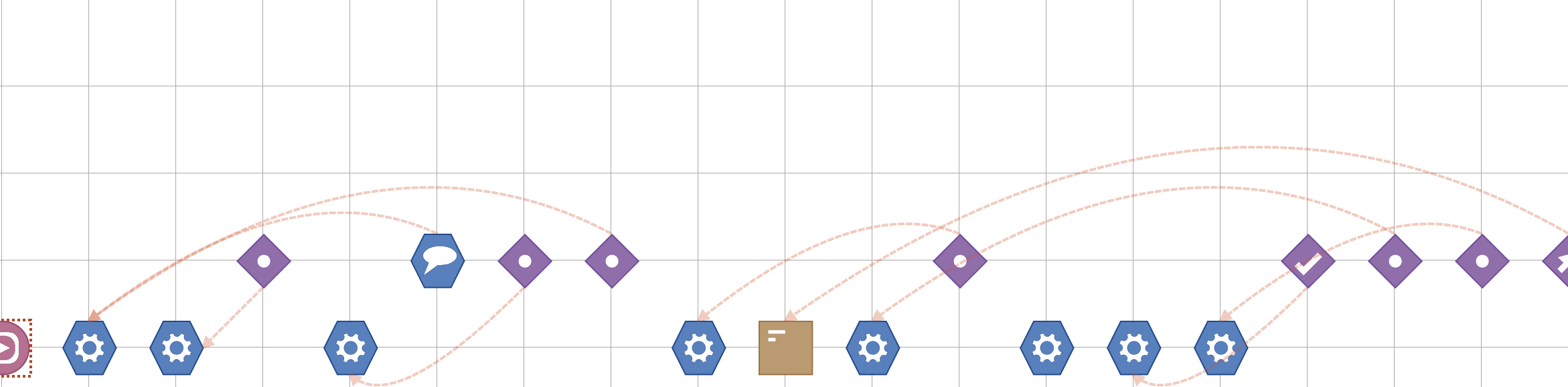
Part of a timeline using the old-style icons
Each icon on a Quill timeline represents a single ‘event’ within a negotiation. Different categories of event are represented by different colours and shapes, and further distinguished by other visual elements. The design evokes the shuffling of pieces of paper that is necessary to manage a formal negotiation in its use of parchment-coloured squares to represent proposed documents or amendments to them, while other shapes are used to capture moments of decision or more complicated procedural manoeuvring. Lucy was set the task of maintaining this visual narrative and ensuring continuity and familiarity for current users of the platform, while at the same time refreshing and modernizing the feel. Nicholas commented, ‘Working with Lucy is a joy. She understood perfectly the constraints that we needed to operate within in order to retain close relationship between our visual design and our underlying data-model, and worked with us on many subtle but important ways to capture meaning within a very constrained and compact visual language.’
The new icons retain the use of shape, colour and artwork to present meaning, but are sharper and bolder with stronger colours:
Part of a timeline using the new-style icons
The new design also allows us to present additional details more clearly, distinguishing, for example, between different kinds of document:
New document type icons
Lucy also implemented a ‘peel’ feature on the icons which allows users distinguish between newly introduced texts, and documents that are the report of another committee, or a line-by-line revision of another text. It is a subtle point of detail important for our more advanced users.
Blue is the new orange
The decision to make more general changes along with this redesign four years after the original launch — and to move away from some of the brighter colours used in the past — is indicative of the fact that a platform which began life as a model of a single constitutional convention with a small number of academic users has grown to include multiple projects and a wide range of users outside of academia. In the words of the Project Director, ‘Our new colour-palette reflects the project’s shift from a highly experimental research proof-of-concept to a platform ready for use in professional settings.’
Lucy’s designs are also starting to feature in the navigation and orientation pages. Further improvements are planned, including orientation pages for each project, so watch this space!
Navigation icons from the Quill platform
“It was fantastic working together with Quill - as a very clear and considerate design partner, they were always very communicative and open to ideas. From a design perspective it was very interesting to try to reflect both the historical significance and focus of Quill’s project, but also their very contemporary outlook and methods for displaying complex interwoven data and timelines. Each symbol had to make logical sense not only by itself, but also when viewed in the context of that whole ecosystem, which was rewarding work.”